How to read a chart: Beginner guide
By Tanner Yarton 10/31/22
Introduction:
Hey Guys,
This week I will be doubling up on posts to focus on a topic I’ve had a few questions and requests about. I will keep it simple, avoiding the discussion of too many indicators or other personal preference add ins.
Traditionally, when you google a stock you get something that looks like this:
This visual style is great to get a brief overview of a companies price action and some simple metrics. However, for stock traders, this is not enough information.
Personally, I use Tradingview.com. Tradingview is a visual tool that allows me to see the price movements of a stock all the way down to the second. Since many of my trades, especially those on twitter can be as short as a few minutes, having this fast, live data is crucial.
Candles:
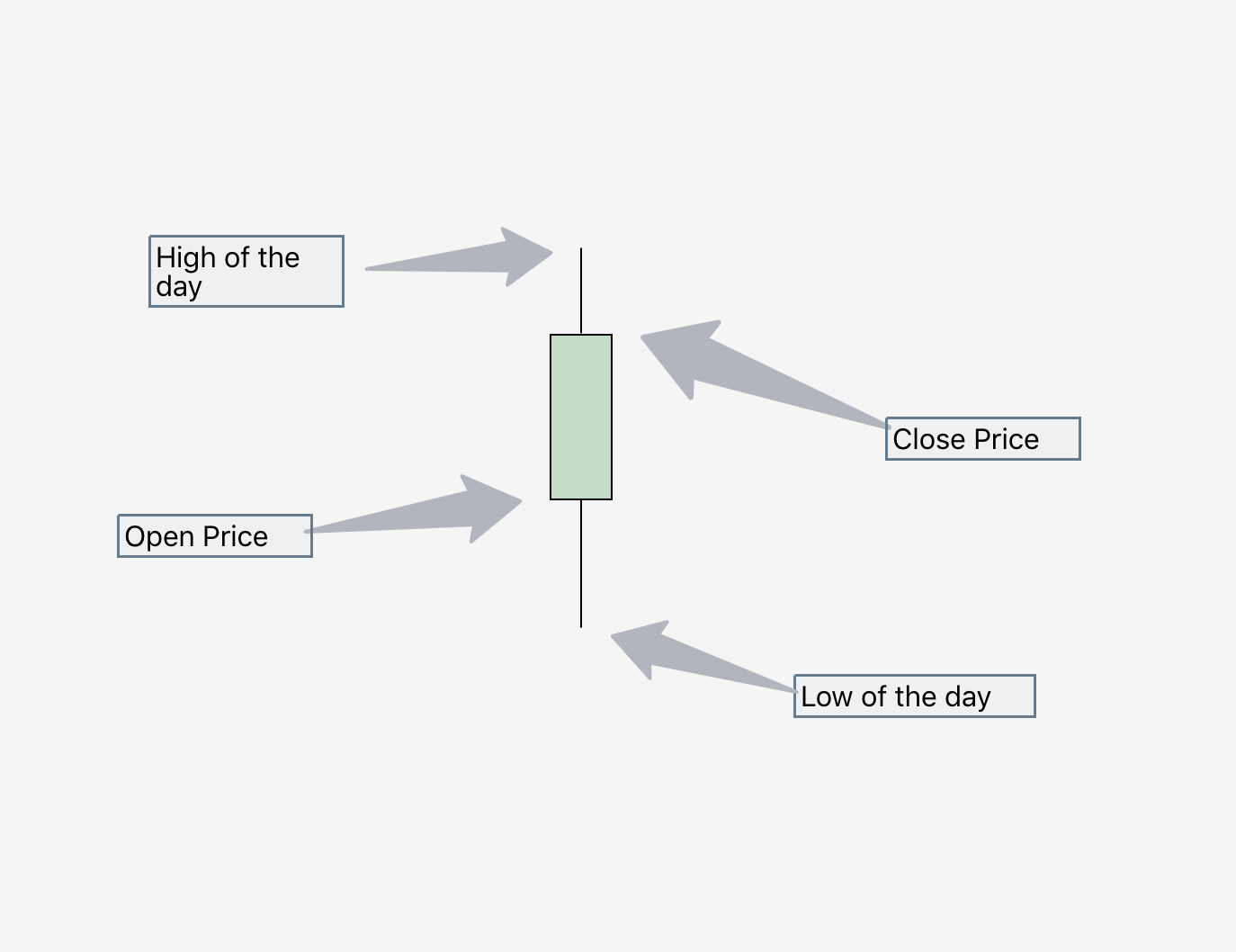
On Tradingview (and other more professional charting services) price action looks a little different. It appears as ‘Candles’. See below:
For the sake of the example, I’m assuming that this candle represents one whole day. As you can see, there are 5 data points, including the color of the candle, which indicates whether it was red (down) or green (up).
Now that we have that out of the way, let’s bring in one of my full size charts to observe.
See below:
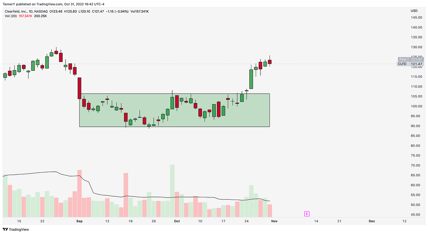
Lots to unpack versus the photo before, but that’s ok. As you can see, there are now multiple candles, representing the day to day price action of Clearfield stock ($CLFD).
The top left of the image shows the company, the exchange its traded on, as well as the open, high, low and close of the most recent candle (day).
In addition to this, the volume is listed on the line below. Volume is the total number of shares traded for a period (day in this case). Volume can also be seen along the bottom, with a black line to represent average volume. I personally look for above average volume and flat price action. This signifies accumulation, which is a more loose description of consolidation.
In the middle of the image, a green box is displayed. This, as seen on many charts is a place in which I’ve found there to be consolidation or accumulation of shares. The color of these boxes doesn’t matter, but for future reference, treat these as support and resistance bounds.
Moving Averages:
Something you may also see on charts are lines. As a general rule of thumb, these lines represent average price over a certain number of sessions. If its a 50sma, it’s the average price of the last 50 candles.
Seen below are the 10, 20, and 50sma, with the 10 being closest to price most often than not and so on and so forth.
Average Daily and Closing Range:
These two ranges are important to understand the direction the stock may move going forward.
Average Daily Range: The difference between highs and lows of a stock, averaged over a timeframe.
Closing Daily Range: Taught by Richard Moglen, Closing Daily range is as follows:
This quick formula gives us a basis to evaluate relative strength and probability of continuation. A CR closer to 100% is a signifier of continuation. I use this on all timeframes to assess my entries compared to the respective index of what I may be trading.
Average Daily range is important, especially in options trading to determine which contracts to select. You wouldn’t want to select contracts that would require a move that is greater than a stock’s average daily range.
For Example:
Stock price: $100.00
ADR: $5
Contracts that expire in 1 day would want to be no more than one ADR above or below current price.
Closing notes:
Charts are a phenomenal tool for not only traders but investors too. Identifying strong entry points, breakouts and breakdowns can save you money on any investment. In a future article, I will breakdown Inside and outside candles that supplement the lesson here, for even stronger, but less common entries.
If you enjoyed, feel free to subscribe at 0 cost below. If you didn’t enjoy, subscribe anyway because why not.
Happy Halloween!
Tanner


